A customized visual identity for a personalized coaching service
We had the pleasure of working with Tri Factory, a personalized sports coaching company based in French-speaking Switzerland, to create their very first visual identity. The challenge was to create a dynamic, professional and inspiring brand image that reflected the athletes they coach.
A logo inspired by the energy of triple effort
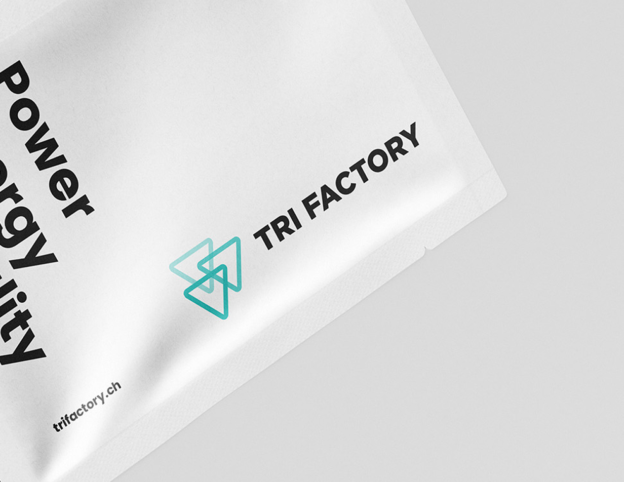
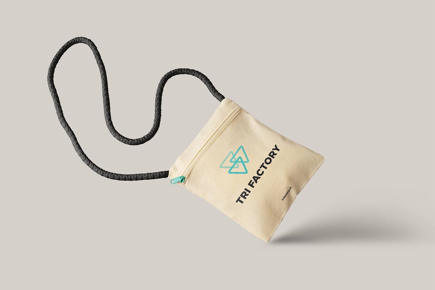
The Tri Factory logo is the heart of the branding: a balanced graphic composition, where power, fluidity and movement meet. Each triangle evokes the three triathlon disciplines, while conveying a sense of continuity and progression. The clean, dynamic design reflects the essential qualities of the triathlete: endurance, precision and determination.
We built a complete visual universe around the logo: sporty, contrasting color palette, modern, legible typography, graphic elements inspired by training trajectories and rhythms.
This branding enables Tri Factory to position itself immediately as a serious and professional player in the triathlon world, capable of attracting both amateur athletes and seasoned competitors.
A brand forged by surpassing oneself
Creating an identity for a triathlon player isn’t just about designing a muscular logo. It’s about understanding and reflecting the discipline’s core values: resilience, consistency, self-control and a passion for progress.
We wanted a visual language that was sober but impactful, that accompanied athletes in their objectives, without ever overdoing it. Each graphic element has been designed to reflect the intensity of the effort, but also the serenity and rigor required for long-term preparation.
The result:
- a coherent and robust graphic universe, ready to evolve with the brand
- an inspiring, motivating and credible brand image
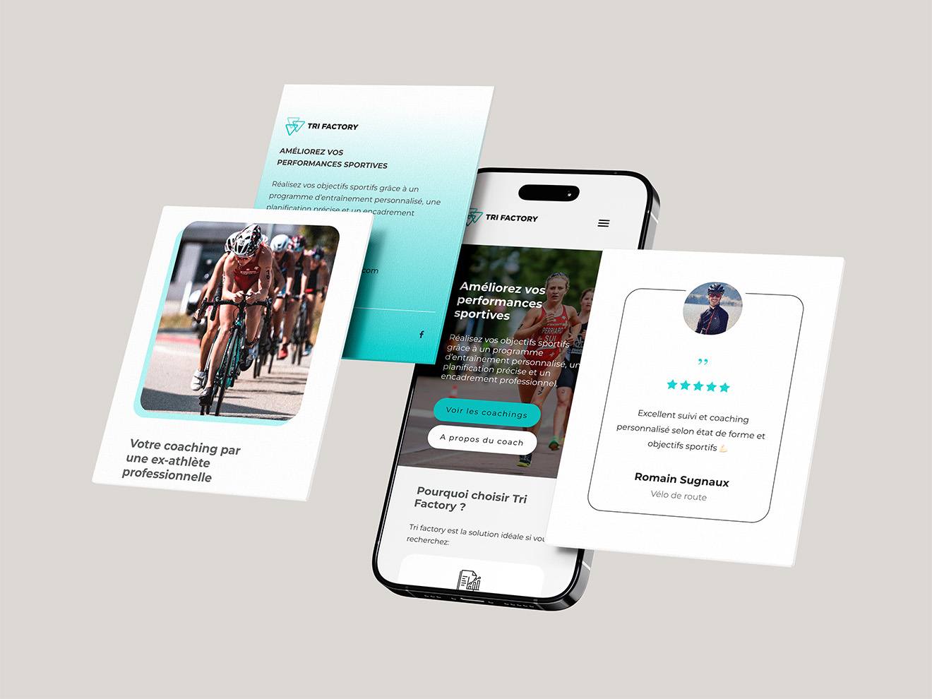
A website optimized for performance
Tri Factory’s digital storefront was designed with the same requirements as the rest of the identity: efficiency, clarity and commitment. The objective was twofold:
1. Present services in a fluid and convincing way
2. Facilitate qualified contacts and requests for support
We have set up :
- responsive design, fluid on both mobile and desktop devices
- intuitive navigation, focused on user needs
- content architecture designed for conversion
On the technical side, we worked on natural search engine optimization (SEO) right from the design stage: optimized structure, enriched content, strategic tags, targeted keywords.
The result is a site that’s as pleasant to explore as it is effective in generating leads.
Tell us about your project!
sabina advertising
Avenue du Mont d'Or 67
1007 Lausanne
Suisse
Please note: the agency is closed on the first Monday of each month.